Thomas Denney

TWSBI Go

The TWSBI Go, a new demonstrator pen from the Taiwanese manufacturer, was released in August 2018 and I purchased mine shortly after its release. I’ve been using TWSBI pens on and off for the last couple of years (I wrote all my finals with a Diamond 580 last year), but until this week I hadn’t spent much time with the Go.

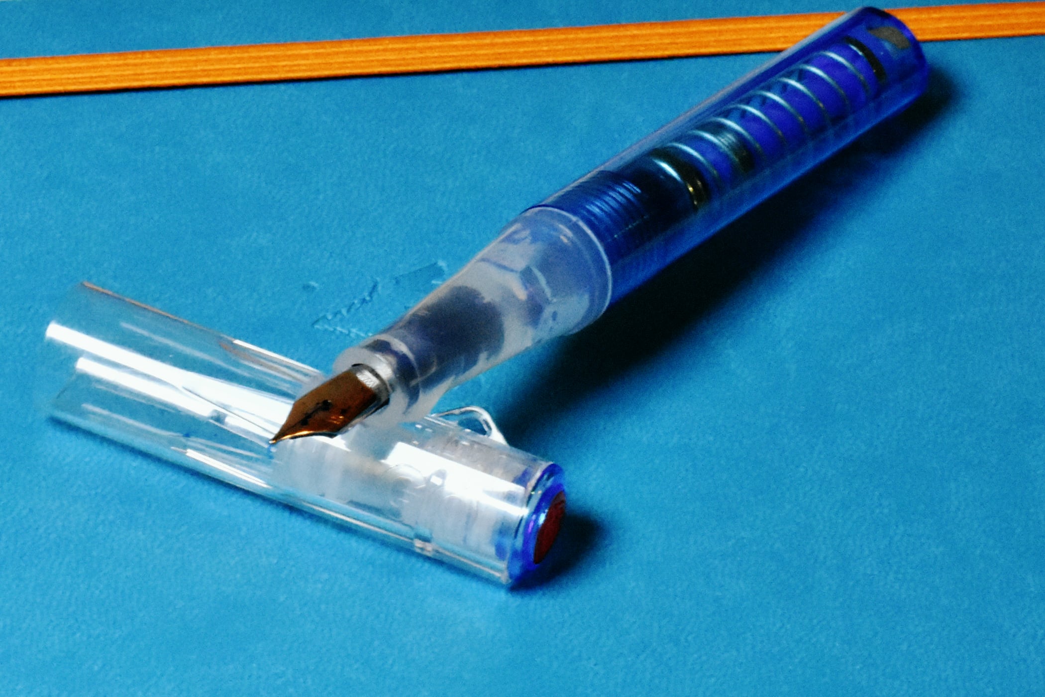
The body of the Go is an all plastic construction, and this makes the pen very lightweight. All the plastic is translucent, and the body is available in either sapphire, pictured, or “smoke”. By far the most interesting aspect of the pen is its filling mechanism. Like other TWSBI pens it doesn’t require a converter or cartridges, and instead includes a spring-based vacuum filling system. All my other pens use screw-based systems, so this was a novelty for me. I’m not a fan of this system because I nearly knocked an ink bottle over whilst releasing the spring, so it serves to be careful.

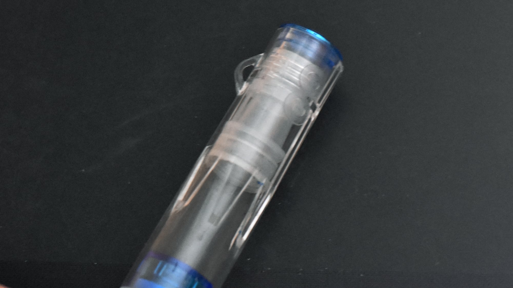
Unlike other TWSBI pens, the cap doesn’t feature a clip. Given that the pen is marketed a pocket pen, I think this is a disadvantage. Instead, TWSBI replaced the clip by a hook for a lanyard. I haven’t seen this on a pen before, but it doesn’t strike me as very useful. The cap is made of plastic, and it is only a little wider than the body. This means that it posts tightly, but I’ve avoiding doing so out of fear that the plastic may crack.

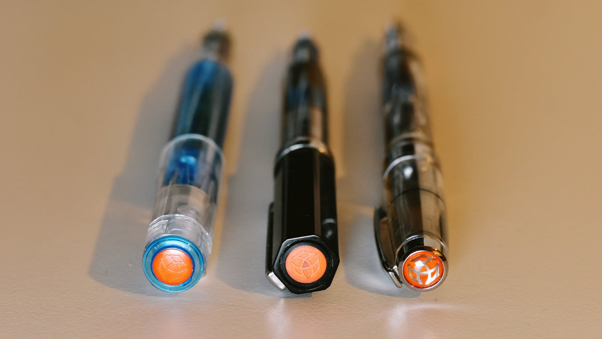
Overall, for the price, the pen writes well and although a little, a comparable experience to the TWSBI Eco. As far as I can tell they both use the same steel nib, although the markings are clearer on the Eco. Both sections are a traditional hourglass shape, but the triangulated shape of Eco is easier to hold.

Left-to-right: The TWSBI Go, Eco, Diamond 580

At $19 it is around $10 cheaper than the Eco, previously their most affordable offering. If you want a great demonstrator I’d recommend getting the Eco over the Go, because you’ll get a slightly bigger pen that rests more comfortably in the hand. Alternatively, if you’d like a pen that your friends will mistake for a vape, the Go is a great choice.

Namisu Nova

Namisu is a company that designs fountain pens in Fife, Scotland. They’ve been operating since 2013, but I only discovered their work earlier this year. As far as I’m aware there are relatively few British pen manufacturers, with most expertise now found in Germany and Japan, so I was keen to try out their work. Predominantly focused on minimalist design, their pens are devoid of any of their own branding. They compensate for this with distinctive shapes and high-quality materials.

The Nova is one of their earliest designs, and has been available for three years. I have the aluminium model in red, although it is also available in brass, titanium, and other colours. Of these, I think the titanium looks the best and I imagine they don’t differ in their ergonomics. Namisu currently also ship the similar Orion and Ixion pens, along with a few rollerballs, although these are more expensive than the Nova.

Each of their pens ships with nibs produced by Peter Bock in Germany. The choice of Bock nibs is a pragmatic one, I think, as they are both a reliable and relatively inexpensive choice. My Nova has a fine steel nib, although titanium and broader nibs are also available. I initially struggled to get ink flowing through the pens, and experimented with a number of inks and notepads, but continued to find that the nib scratched the surface of the paper, often without flow. However, after flexing the nib a little I eventually managed to get ink flowing comfortably from the pen without issue.

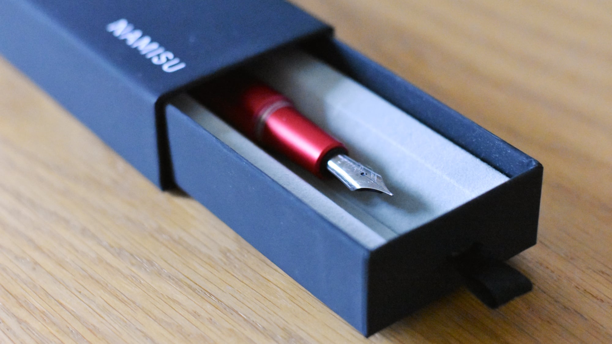
The Nova ships in an attractive box and with a standard international converter

Although it looks very nice, I didn’t find the Nova terrificly comfortable to write with, especially for longer periods. The section — the part you grip with your fingers — is wider than any other pen I own, and its surface is completely flat, rather than a gentle curve or moulded grip seen on other pens. Those with small hands may find the pen uncomfortable to maneuver, but I can certainly see the pen being more comfortable for those with larger fingers. The flat surface was a bigger issue, especially considering that the pen seemed to initially require significant pressure to get ink flowing, with my fingers left with pen-shaped indentations after an hour or two of use. The only other significant downside of the design is that it tended to roll a lot on my desk.

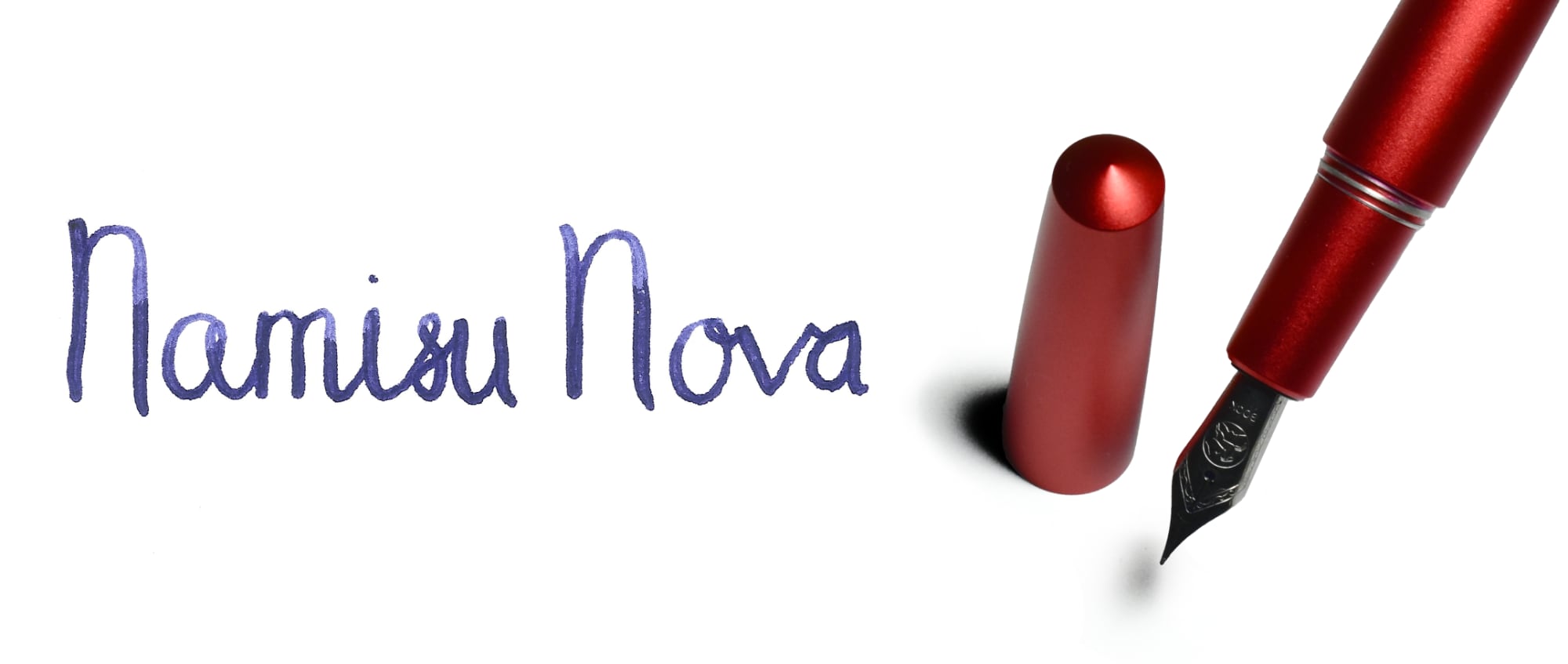
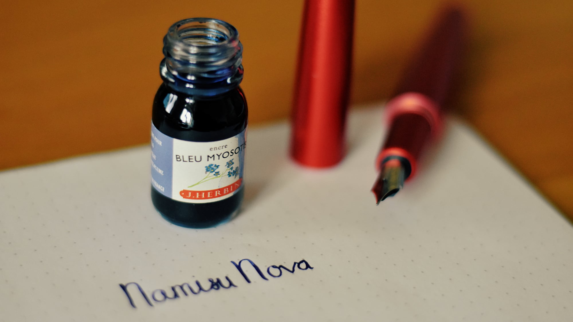
The Nova pictured with J. Herbin Bleu Myosotis ink

Overall, I wouldn’t recommend the Nova over other pens in its price category — TWSBI certainly make significantly nicer pens for a similar price — but from an aesthetic perspective it is certainly worth it. There are very few pens with all-metal bodies available at that price, and after about six months of ownership I haven’t noticed a single scratch anywhere on the body; this pen is durable. I haven’t yet experimented with posting the pen, but I wouldn’t recommend it as the cap screws on and off. Prior experience suggests that the screw thread is likely to eventually damage the body.

The Nova is available at Namisu’s online store for £45.

The KOSMOS Pen

Aluminium KOSMOS ink in Night Sky

In general I am not a fan of ball point pens, but the magnetic cap design of the KOSMOS pen intrigued me. Rather than pressing a button or removing a cap, the KOSMOS pen by Stilform, a design studio based in Munich, allows you to pull back on the cap, which is then held in place magnetically. It is a simple but effective idea.

Stilform clearly care about design, and the KOSMOS pen is certainly the best designed ballpoint that I’ve used. That design does come at a price; my aluminium model cost €50, but a titanium bodied model is also available at €100. The aluminium models come in five colours, three of which are intentionally similar to Apple’s MacBook lineup.

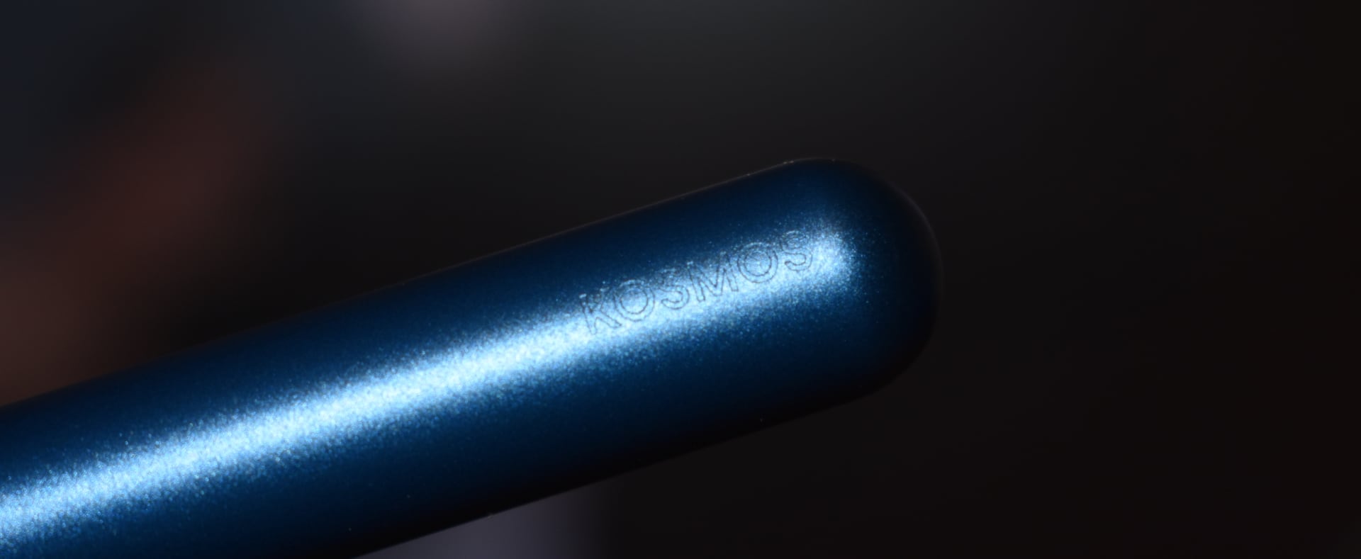
Aside from the magnetic cap, one of pen’s best features is barely mentioned in Stilform’s marketing: the pen rolls very little. I suspect they’ve weighted the body on one side, but I couldn’t tell where after playing with it for a few minutes. I was a little disappointed to find that it didn’t always roll to show the logo, which is engraved near the top of the pen. I think the engraving could be a little deeper, but the rest of pen’s design seems to call for minimalism.

I struggled to find good lighting to show the logo’s shallow engraving

Before I received the pen I wasn’t sure which part of the pen actually moves when you shift the cap. The cap screws onto the black segment that initially separates the cap from the body, and both of these move when the cap slides — the refill always stays in place. I’d like the cap to screw in a little tighter, although only because I fiddled with it repeatedly this week! When I did unscrew the cap I found that the spring inside it would often come loose and fall out; I think a grove near the end of the cap could solve this problem.

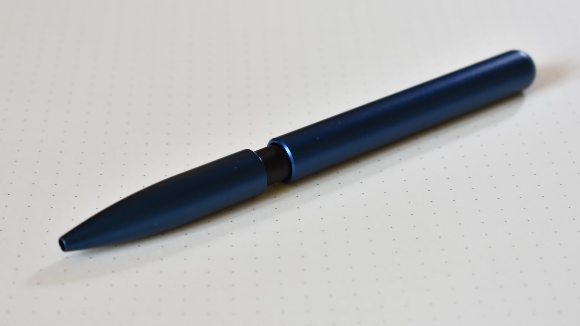
The pen, with the cap covering the refill cartridge

The pen is loud. Not to write with, but with the snap as you shift the cap in and out of place. By way of comparison, it is much louder than closing the lid of my AirPods case and certainly louder than any other retractable pen that I’ve used before.

The included Stilform cartridge let the rest of the pen down. I initially found that I had to apply a lot of pressure — a lot more than I would apply with other ballpoints — to get a consistent stroke. Thankfully the cartridge is a standard (it is the same ISO G2 cartridge that Parker include in their ballpoints), so it can be easily replaced. Otherwise, the pen is a very comfortable weight and I didn’t have any issues writing with it for a few hours.

On the top line I applied extra pressure whilst on the second I allowed the ballpoint to roll across the paper.

As much as I like the elegant design of the KOSMOS pen, I’ll continue using fountain pens for regular writing. At the moment I’m carrying it in my backpack for situations where I have to write on paper that ink would bleed on.

Later in 2018 Stilform will release the KOSMOS Ink, a fountain pen with a removable magnetic cap. I’ve pre-ordered the pen, and I look forward to seeing their ideas applied to other stationery.

Learn to Code 2018

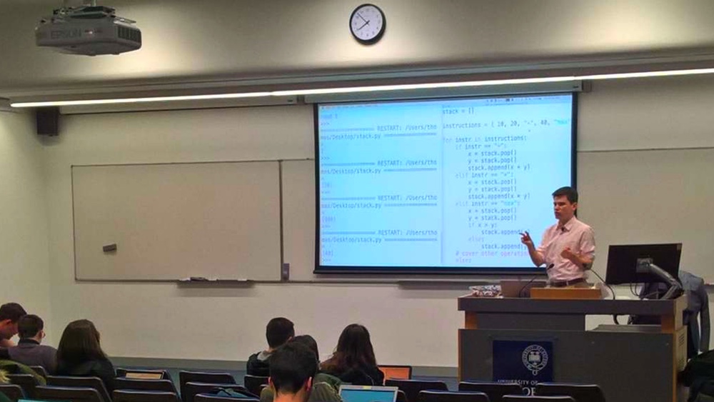
Yours truly presenting the final session

Over the course of the last term I presented five introductory Python sessions as part of the Oxford University Computer Society’s Learn to Code series. This year we saw the highest demand ever for the course, with over 1,100 people “interested” on Facebook and more than 200 attending the sessions — we packed out both lecture theatres in the Department of Computer Science!

All of the session materials from the course are available here. Note that this is my personal fork of the course materials with the version that I presented (it is quite likely that a future commmittee will present a different version next year). A playlist of all the screen recordings is available on YouTube. This was the first time I’d ever done any video editing, but in the end it turned out to be more of an exercise in audio editing.

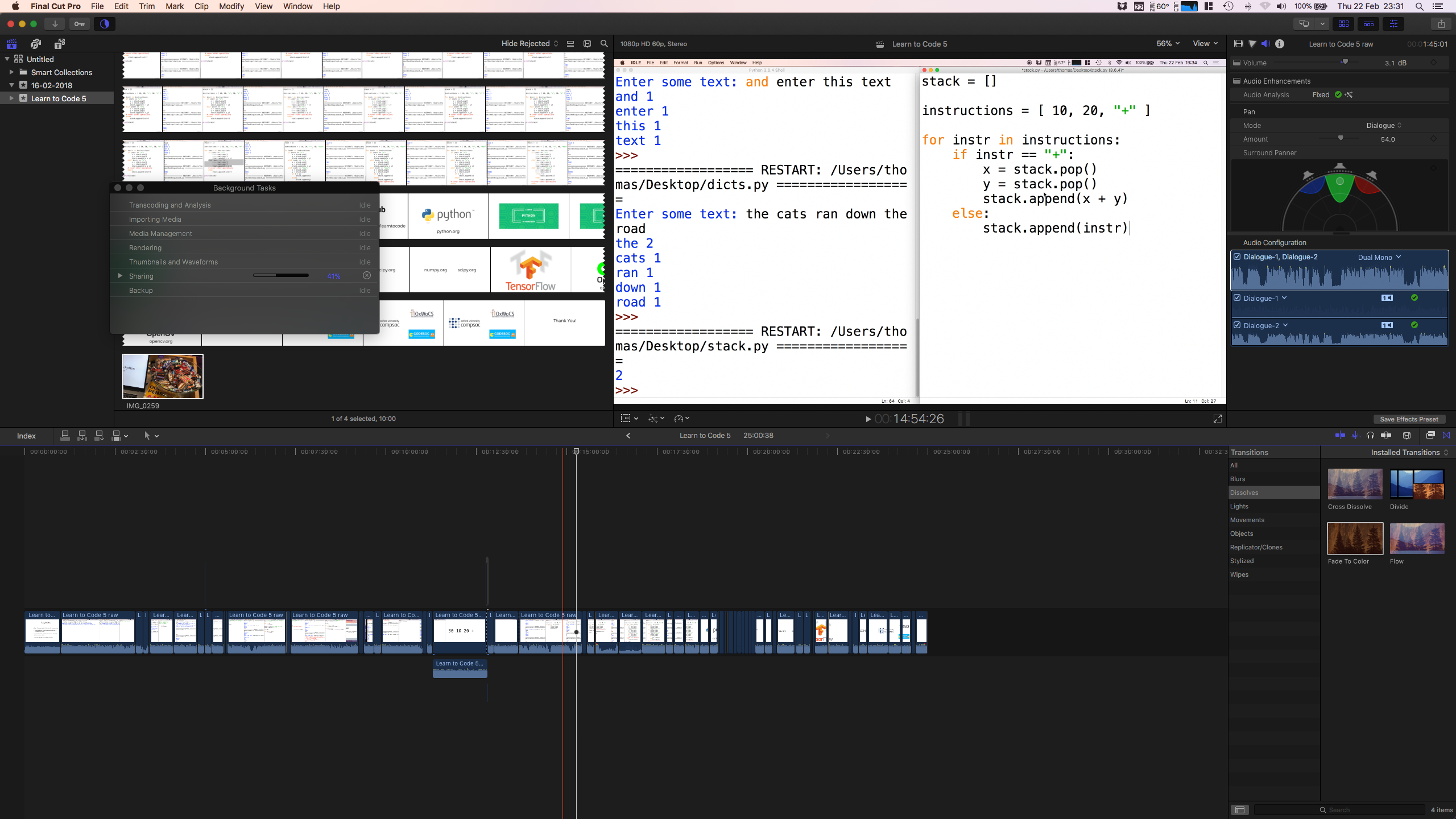
Editing the final session in Final Cut Pro

The first video was edited entirely in iMovie, but from the second session onwards all the video was edited in Final Cut Pro. I imagine that iMovie would have been sufficient for all the videos, but I fancied trying out Final Cut Pro.

We used a Focusrite Scarlett Solo interface along with the cheapest wireless mic I could find on Amazon to record the audio. I later had to redub a few of the sessions due to recording issues in the lecture theatre, but most of the audio was recorded live. The sessions recorded in the lecture theatre sound a lot better and, as a friend commented, avoid the “teenager making Minecraft videos” vibe. I struggled to get audio levels right until the very end of the course, so many of the early videos are far too quiet. By the end of the course I was also a lot more leniant in what I allowed through the editing process; some of the early sessions don’t have a single utterance of “erm”, “OK”, or “so” but by the end I gave up and tried to keep the editing process straightforward.

It would have been nice to record video for the session in addition to the screen captures, but a lack of preparation on my part killed this plan. Besides, each session required around a total of ten hours a week to prepare the resources, reheasrse, execute the session, and then edit the video and I don’t think I could have spared much more time out of an already packed term.

I am indebted to the dozen-or-so Oxford CS students that dedicated their Thursday evenings with me to run the course this year, in particular to Sauyon Lee, who presented sessions in a second lecture theatre. The student helpers managed everything from registration to helping out students with exercises, which allowed me to focus on just the presentation during the sessions.

Although Learn to Code was undoubtedly my greatest success as president of Oxford’s Computer Society, there are many ways in which the course could be improved, and I leave this advice to my successor next year:

  • Don’t be afraid to go slowly. In the first session I discovered that around half the audience had done some programming before, and sped up the session to cater for them. This was a mistake — I should have continued with my plan to aim the content at complete beginners
  • Encourage students to do exercises as much as possible, as early as possible. A small number of students went away and did nearly every exercise in the notes, and they definitely made the most progress over the course
  • Provide other materials that students can look at after the course or between sessions
  • Video editing is really hard! If the next committee plans to film the 2019 sessions then I hope they can find somebody that can edit the video content, because it certainly consumed far too much of my time
  • Focus on getting syntax right before introducing algorithms. My experience this year and last year was that once students mastered the basics of Python syntax they were far more able to solve problems than introducing algorithms and syntax concurrently. We definitely introduced the binary search algorithm too early this year, for example

Overall, teaching Learn to Code this year was an absolute pleasure. Even after relatively high demand for the course last year I was shocked to see so much demand this year, and I loved seeing so many students returning each week.

At the beginning of term I met with David Malan, the originator of Harvard’s CS50 course, and after hearing of such high demand at Harvard for a programming course I was delighted we could replicate similar demand on this side of the pond. I wish the very best to my successors teaching our course, and I’ve no doubt its popularity will continue to grow.

Play Time 3.1

Play Time, my music statistics app, now supports the iPhone X and has lots of fixes for iOS 11. Here’s what’s new in this release:

  • Support for new iPhone sizes and iOS 11
  • Use the predominant colour of an album’s artwork when artwork is disabled
  • Sorting by Album Artist
  • Sorting options when breaking down by album, artist, or genre
  • Removed option to display play count - it is now displayed based on context
  • Explicit songs play time

Fixed:

  • Crashing bug when collecting library data
  • Resolved bugs related to row selection
  • Ensured the typeface is consistent across the app
  • Removed old style app rating

You can download the Play Time for $0.99 on the App Store.

Scala's Privates

As well as the usual public, protected, and private access control modifiers, which have with same rules as their Java siblings, Scala also supports the private[this] modifier, which prevents access to a property from other instances. For example, the following code would not compile:

class A {
  private[this] var x = 0

  def inc(a: A) = a.x = a.x + 1
}

Whereas this would be fine:

class B {
  private var x = 0

  def inc(a: A) = a.x = a.x + 1
}

Whilst the access control rules are applied at compile time, they lead to slightly different code generation. In the case of a property marked private a private field, a getter method, and a setter method are added to the class. All code that accesses the field (aside from its initialisation) will go through either the getter or setter. On the other hand, a private[this] field will only add the field to the class, and all access to the field is direct, rather than through accessor methods (as, after all, all access is only done by the instance).

The behaviour of the Scala compiler can be verified using the javap tool, part of the JDK that prints Java bytecode in a human readable form. I compiled the following two Scala classes:

class A { private var x: Int = 37; def add() = x = x + 1 }
class B { private[this] var x: Int = 37; def add() = x = x + 1 }

The output of javap -p -c A, the class that doesn’t use private[this], is:

Compiled from "Classes.scala"
public class A {
  private int x;

  private int x();
    Code:
       0: aload_0
       1: getfield      #13                 // Field x:I
       4: ireturn

  private void x_$eq(int);
    Code:
       0: aload_0
       1: iload_1
       2: putfield      #13                 // Field x:I
       5: return

  public void add();
    Code:
       0: aload_0
       1: aload_0
       2: invokespecial #22                 // Method x:()I
       5: iconst_1
       6: iadd
       7: invokespecial #24                 // Method x_$eq:(I)V
      10: return

  public A();
    Code:
       0: aload_0
       1: invokespecial #27                 // Method java/lang/Object."<init>":()V
       4: aload_0
       5: bipush        37
       7: putfield      #13                 // Field x:I
      10: return
}

The particulars of the JVM’s instructions aren’t important for our discussion, but we can see that Scala methods x() and x_=(int) are generated here, and we can see that they are used in the add method. Meanwhile, we see the following for javap -c -p B, the class using private[this], is:

Compiled from "Classes.scala"
public class B {
  private int x;

  public void add();
    Code:
       0: aload_0
       1: aload_0
       2: getfield      #14                 // Field x:I
       5: iconst_1
       6: iadd
       7: putfield      #14                 // Field x:I
      10: return

  public B();
    Code:
       0: aload_0
       1: invokespecial #19                 // Method java/lang/Object."<init>":()V
       4: aload_0
       5: bipush        37
       7: putfield      #14                 // Field x:I
      10: return
}

Here the add method directly accesses the field via the getfield and putfield instructions, rather than generating accessor methods. The astute reader may wonder whether Scala’s use of accessor methods for all private properties is slower than using private[this] or writing similar code in Java. Should you aim to use private[this] whenever you can to give yourself a performance boost?

The short answer is no. The JVM will eventually inline the getter and setter where they are used so that each access is executing the same native code as the private[this] version. In my tests, over 10 million invocations of the add method the class that used private was around 1% slower than the one using private[this], but over 100 million invocations it was around 0.3% slower.

By passing the flags -J-XX:+PrintCompilation -J-XX:+UnlockDiagnosticVMOptions -J-XX:+PrintInlining to the scala command you can view when a method is inlined by the JVM (these are Java flags, hence the need to prepend them with -J). I found on my machine that it generally took fewer than 20,000 invocations of the add method for the x_= method to get inlined inside it, leading to identical execution of both versions. The number of invocations of the method isn’t a fantastic metric to go by, as other factors (CPU load, timing, etc) also play a part in when a method gets inlined, and not all methods can be inlined because they are too large. For more complex methods, the cost of method invocation is much smaller than actually executing the method.

private[this] should therefore be used when you need it for the specific access control for which it was designed. There is no need to hand optimise your code to use private[this], the JVM will do it for you!

More articles for Microsoft Faculty Connection

After attending the Microsoft Build conference in Seattle in May, I wrote a bunch of blog posts for the Microsoft Faculty Connection blog:

Yeah, I quite like functional programming :).

Typesetting algorithms with LaTeX

The algorithmicx package provides macros for typesetting algorithms that can include math or text, and code blocks are automatically indented. I don’t particularly like the default style, however, as it redundantly includes a line for the end keyword for each block and doesn’t allow for single line if statements, while loops, or for loops.

I therefore use the following:

\usepackage{algpseudocode}
\algtext*{EndWhile}
\algtext*{EndFor}
\algtext*{EndIf}
\algtext*{EndFunction}

\algnewcommand{\SIf}[1]{\State\algorithmicif\ #1\ \algorithmicthen}
\algnewcommand{\SElseIf}[1]{\State\algorithmicelse\ \algorithmicif\ #1\ \algorithmicthen}
\algnewcommand{\SElse}{\State\algorithmicelse\ }
\algnewcommand{\SWhile}[1]{\State\algorithmicwhile\ #1\ \algorithmicdo}
\algnewcommand{\SFor}[1]{\State\algorithmicfor\ #1\ \algorithmicdo}
\algnewcommand{\SForAll}[1]{\State\algorithmicforall\ #1\ \algorithmicdo}

This eliminates the end keywords and allow for the single line if statements, for example:

The above is typeset using:

\begin{algorithmic}
    \Function{Heapify}{$A, i$}
        \State $n := $ \Call{HeapSize}{$A$}
        \State $l := 2i + 1$
        \State $r := 2i + 2$
        \SIf{$l < n \wedge A[l] > A[i]$} $largest := i$
        \SElse $largest := i$
        \SIf{$r < n \wedge A[r] > A[largest]$} $largest := r$
        \If{$largest \neq i$}
            \State \Call{Swap}{$A[i], A[largest]$}
            \State \Call{Heapify}{$A, largest$}
        \EndIf
    \EndFunction
\end{algorithmic}

Using F# for serverless REST APIs

As part of my role as the Microsoft Student Partner lead at Oxford, I recently wrote an article for the Microsoft Faculty Connection blog on using F# to write serverless REST APIs.

Play Time 3

The third major version of my music statistics app Play Time is now available on the App Store. Play Time allows you to find out which songs you’ve spent the most time listening to, and allows you to analyse your music listening habits over time. The new version of the app allows you to do more specific breakdowns for your music library, find out which songs you’ve spent the most time listening to this week, and view more statistics about your library as a whole.


Previous versions of the app only showed songs sorted by the time you’d spent listening to them, i.e. the play time of the song, but it is now possible to sort by other statistics, such as the play count or duration of the song. Like the last version of the app this extends to artists and albums, and Play Time 3 adds the option to analyse genres too.


Since version 2 Play Time has supported viewing when you’ve spent time listening to your music, but it was harder to view what you were listening to. Play Time 3 adds a “top this week” feature and can optionally remind you to check out what you’ve been listening to once a week.

One of the more whimsical features of the app is the set of bonus facts and statistics it can provide about your music library. The most recent addition is comparing the height of your music library as CDs with other objects and buildings.

You can download Play Time on the App Store for $0.99.